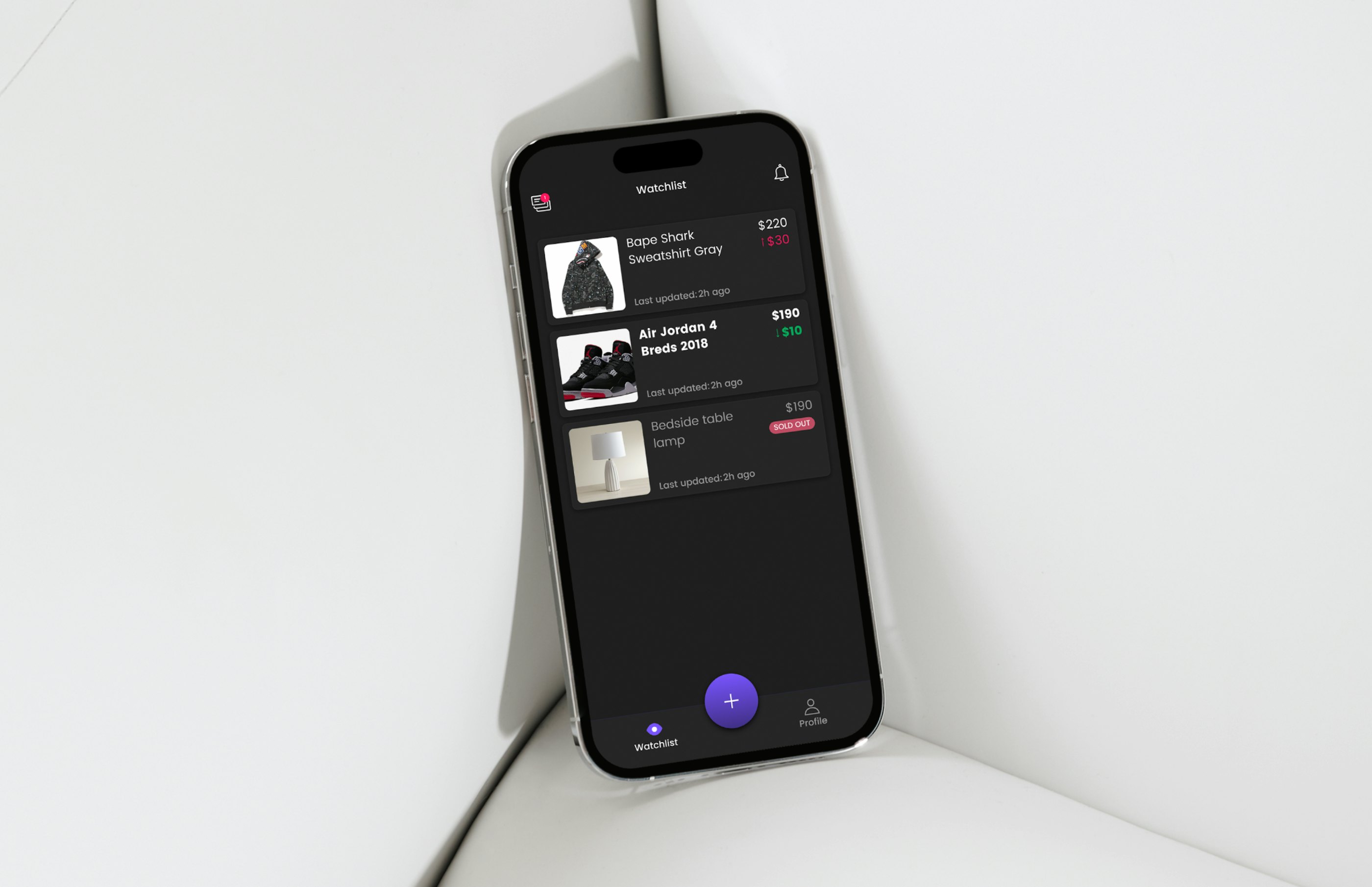
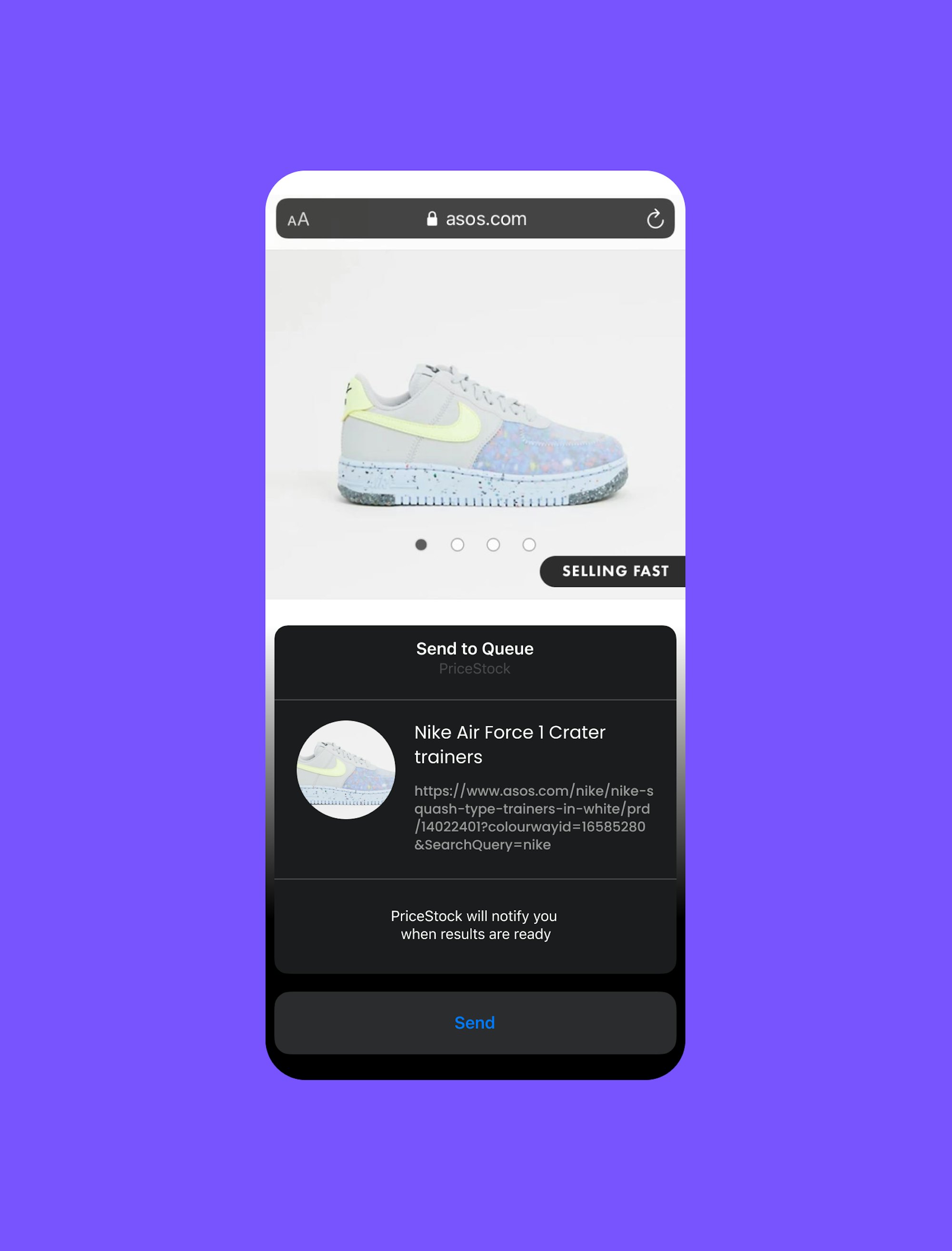
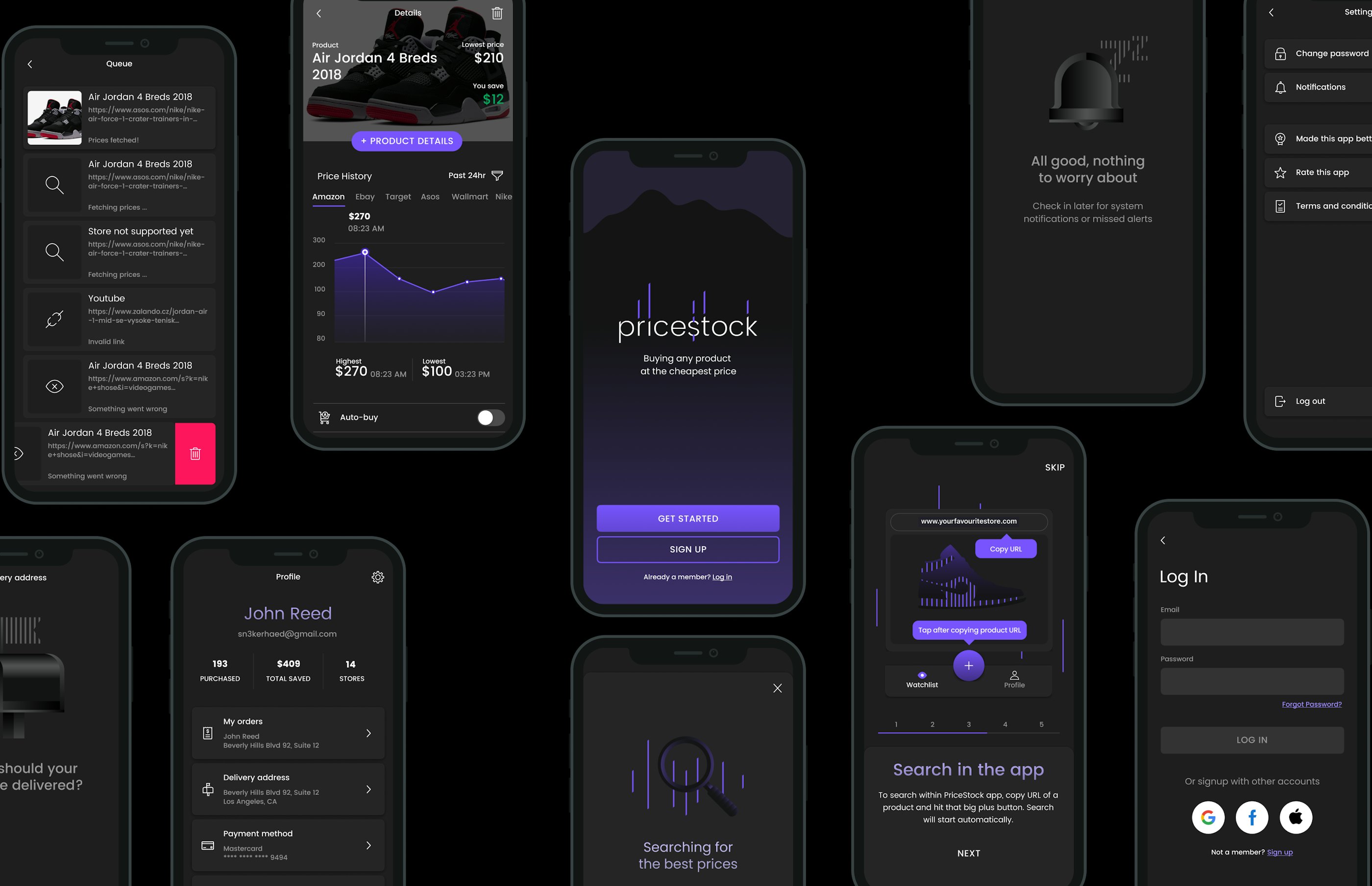
Pricestock is a mobile application watching prices of products and notifies users when conditions match their preference. The app enables user to search for goods from the internet, track price fluctuation and set up automatic buy when price drops under a specified amount.
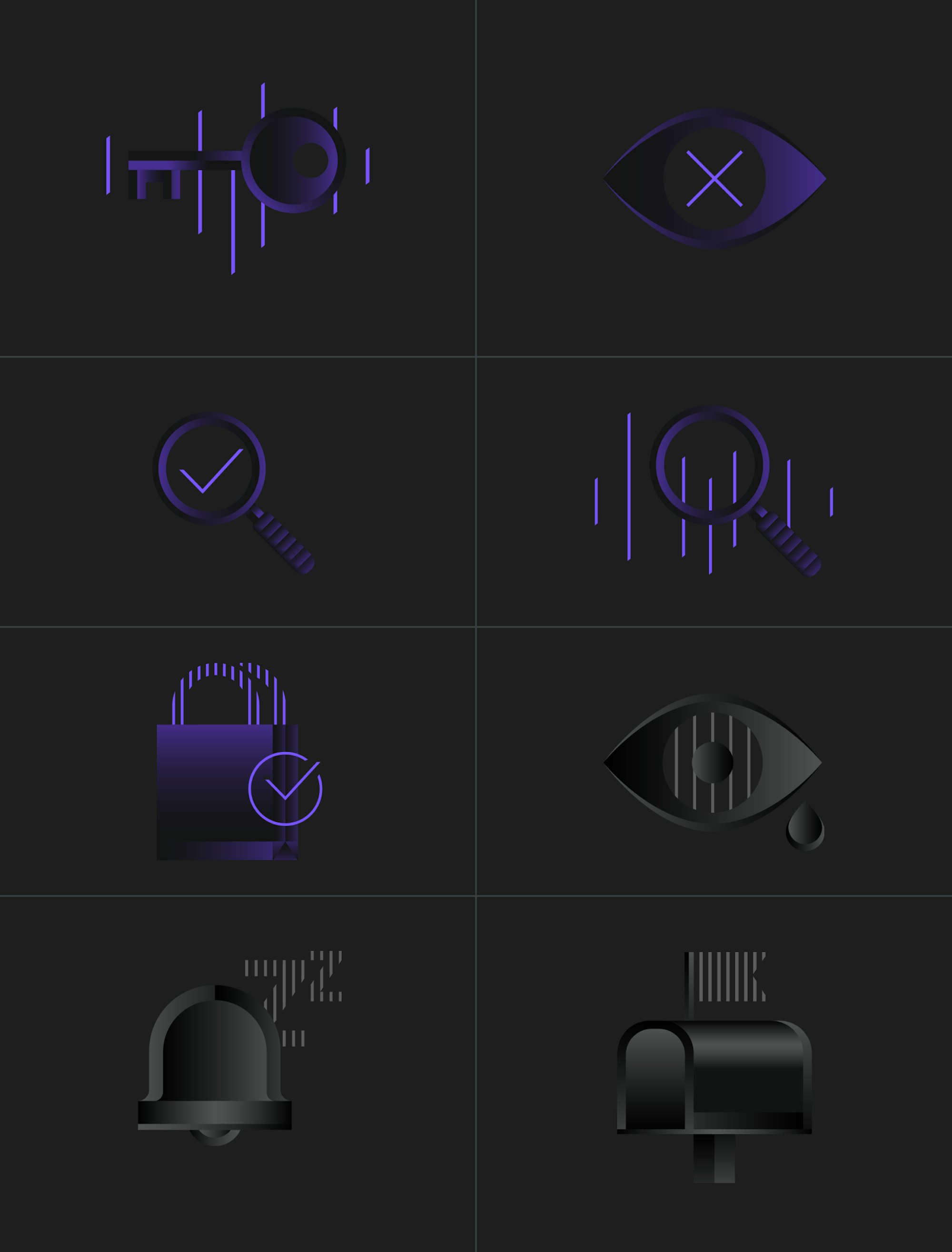
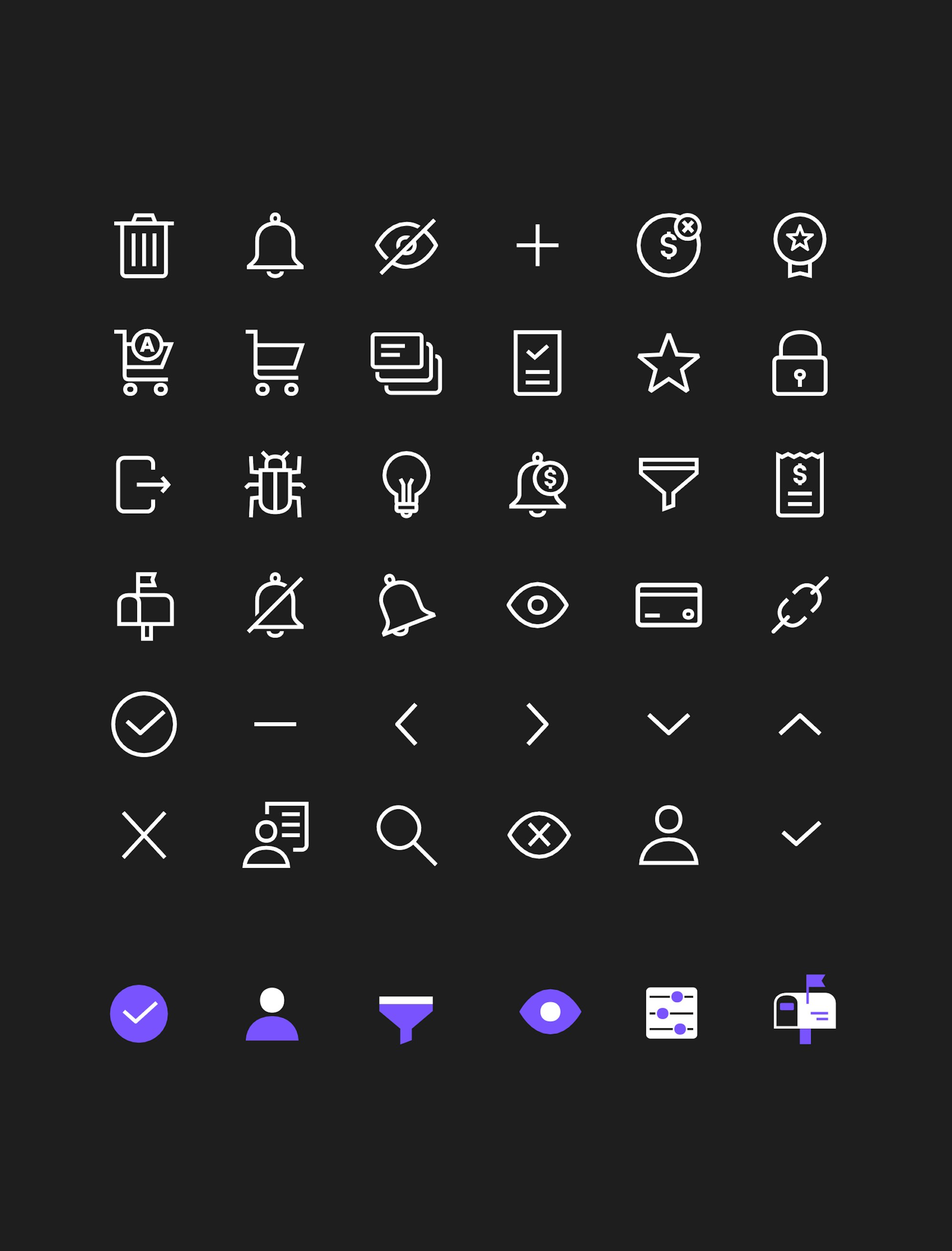
ByAllMeans team delivered visual brand identity, illustration system, icon set, product UI design and development of the iOS mobile application.
PriceStock’s visual identity is inspired by elegant aesthetic of Wall Street stock firms, mixed with contemporary less uptight graphic style, which together creates a unique established, serious and trustworthy look, while staying approachable and attractive for any demographic.
Violet stripes are the main visual element of the identity, which represents price fluctuation graph and references to stock market visual language.
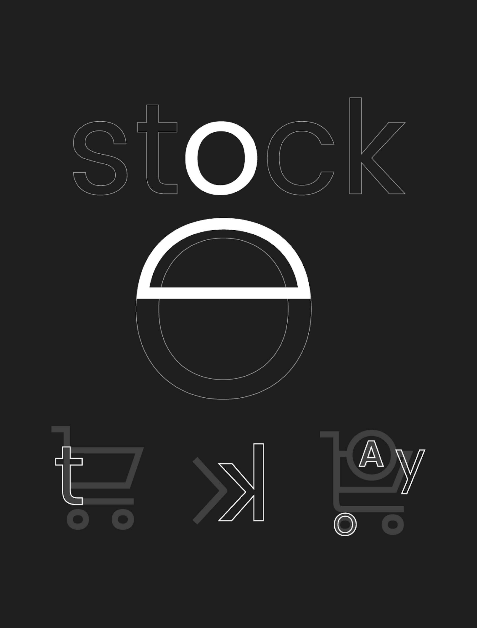
Logo is set in customised Poppins Light typeface with violet lines prolonging some of the letter stems. This makes the logo an embodiment of a price fluctuation graph and bring in a stock market vibe to the mark. Tops of stems and violet lines are cut under the same angle pointing towards upper right, which makes the logo more dynamic and suggests a positive progression, while creating visually pleasant smooth connection between typography and the graphic part of the logo.